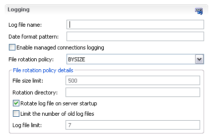
So I was working on an Eclipse form-based editor the other day when I came across a rather interesting UI puzzle. In my model, I have an enumeration field. Depending on what the user selects, certain other detail fields become relevant and need to be shown. Previously, I have solved this problem by putting the master combo field first followed by a details frame that contains all the detail fields and is updated when combo selection is made. That worked relatively well when that master-details block was in a section by itself, but as soon as it got surrounded by other fields, it started to become difficult to tell at a glance that the combo and the frame belonged together and were separate from other fields in the section.
See for yourself...

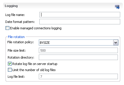
Besides dancing around the problem by adding a little white space above the master combo or putting the entire master-details block into a section by itself, one other approach occurred to me. Here, the master and detail fields are next to each other and enclosed together in a frame.
Both approaches have their pluses and minuses. The second approach does make it more clear that master and details are tied together, but we loose the ability to identify what is master and what is details. My question for the UI experts out there is how do you typically render such master-details blocks? Do you use one of these approaches that I described? Something else entirely?


3 comments:
You can try to indent the details section from the master... that may help a bit in your space limited situation.
First: if there are not too many options in the drop down, make it into a radio button. That way users get a better hint that they have to make a selection. Put this radio into a separate group.
Put all the other fields that depend on the radio selection into another group.
In your case this would mean that the logging rotation policy would become a radio, the fields specific to the rotation policy would become independent composites that are on top.
Something like this, or this
Radio buttons are definitely better. If there are policy specific settings then it would be better to place the radio buttons below each other and the specific setting should be placed intended below the corresponding policy. In contrast policy common settings should not be indented.
By the way the dialog could be simplified:
- "Log file name:" => "File name:"
- "Date format pattern:" => "Date format:"
- "Enable managed connection logging" => "Managed connection logging"
- …
And all the rations make me dizzy. ;-)
Post a Comment